A coffee bar in Kushiro, Hokkaido — quiet, deliberate, and grounded in the boyish fascination of an all-black room.
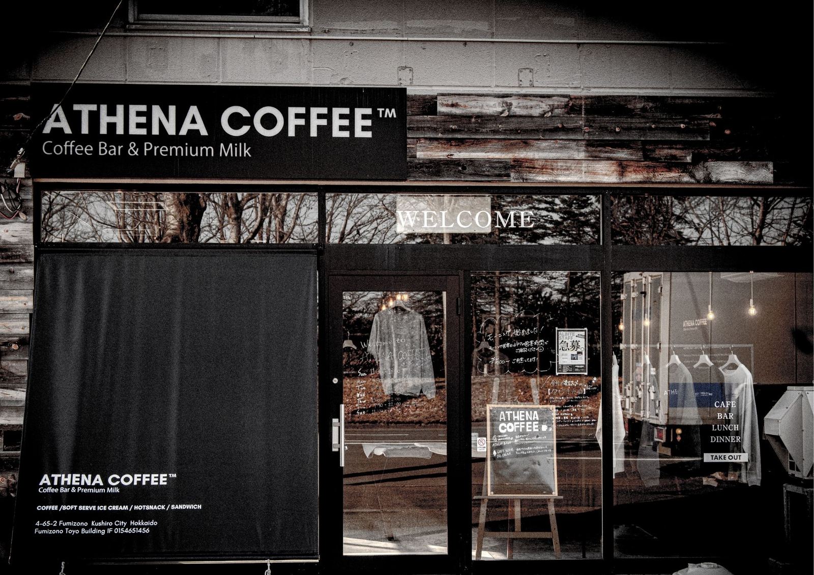
This brand book serves as a record of how ATHENA COFFEE came to life — documenting the background, thoughts, and process behind the creation and opening of the brand.
What follows is not a portfolio. It is a chapter from a larger book — kept as it was written, including the imperfections.
In August 2024, we began designing the ATHENA COFFEE logo — and chose to keep the unrefined first version alongside the final one.
The initial version had no design adjustments — no kerning or refinement had been applied. While the adjusted logo, with proper kerning and refinement, is used on the store signage, many of the early printed materials still feature the unrefined, original version.
This includes mugs and other merchandise as well. But in hindsight, we've come to see those early imperfections as part of the journey — memories we've chosen to keep.
When sending data to contractors for the interior construction and exterior signage, we were at least able to provide a slightly more refined version of the logo — so the visuals came out looking relatively decent.
It's not an excuse, but the schedule leading up to the opening was extremely tight, and we simply didn't have the time to fine-tune every detail of the design as much as we would have liked.
The interior concept is centered around the color black — inspired by a personal memory.
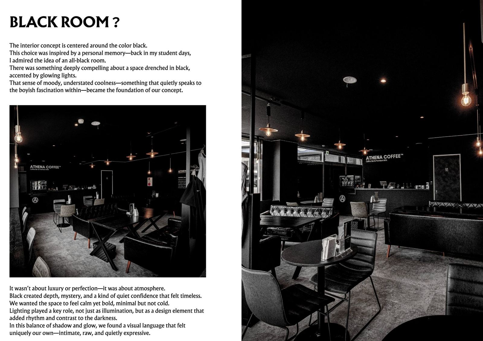
Back in my student days, I admired the idea of an all-black room. There was something deeply compelling about a space drenched in black, accented by glowing lights. That sense of moody, understated coolness — something that quietly speaks to the boyish fascination within — became the foundation of our concept.
It wasn't about luxury or perfection — it was about atmosphere. We wanted the space to feel calm yet bold, minimal but not cold. Lighting played a key role, not just as illumination, but as a design element that added rhythm and contrast to the darkness.
In this balance of shadow and glow, we found a visual language that felt uniquely our own — intimate, raw, and quietly expressive.
Built through the renovation and rebranding of our previous store, GUGU Milk Bar.
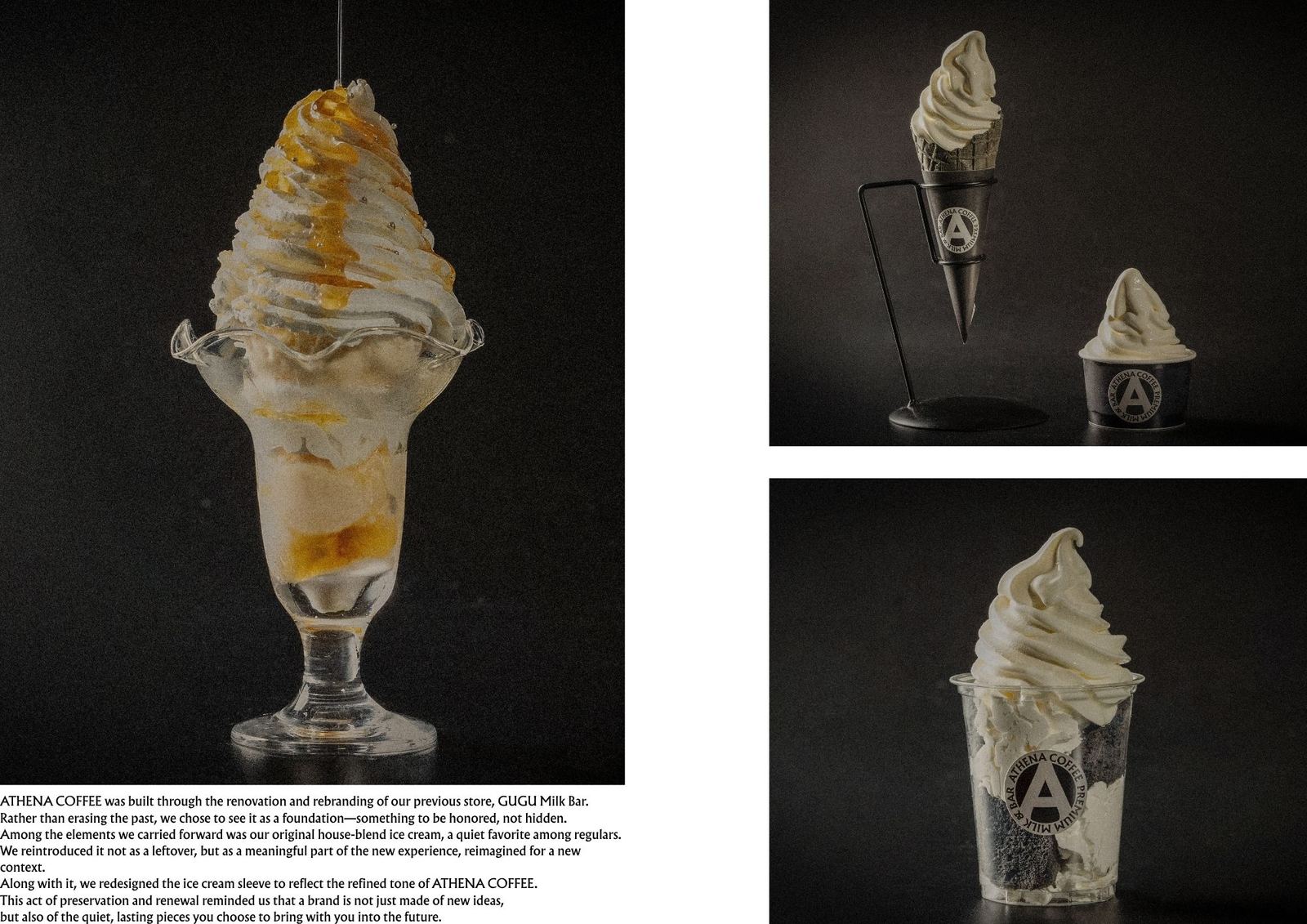
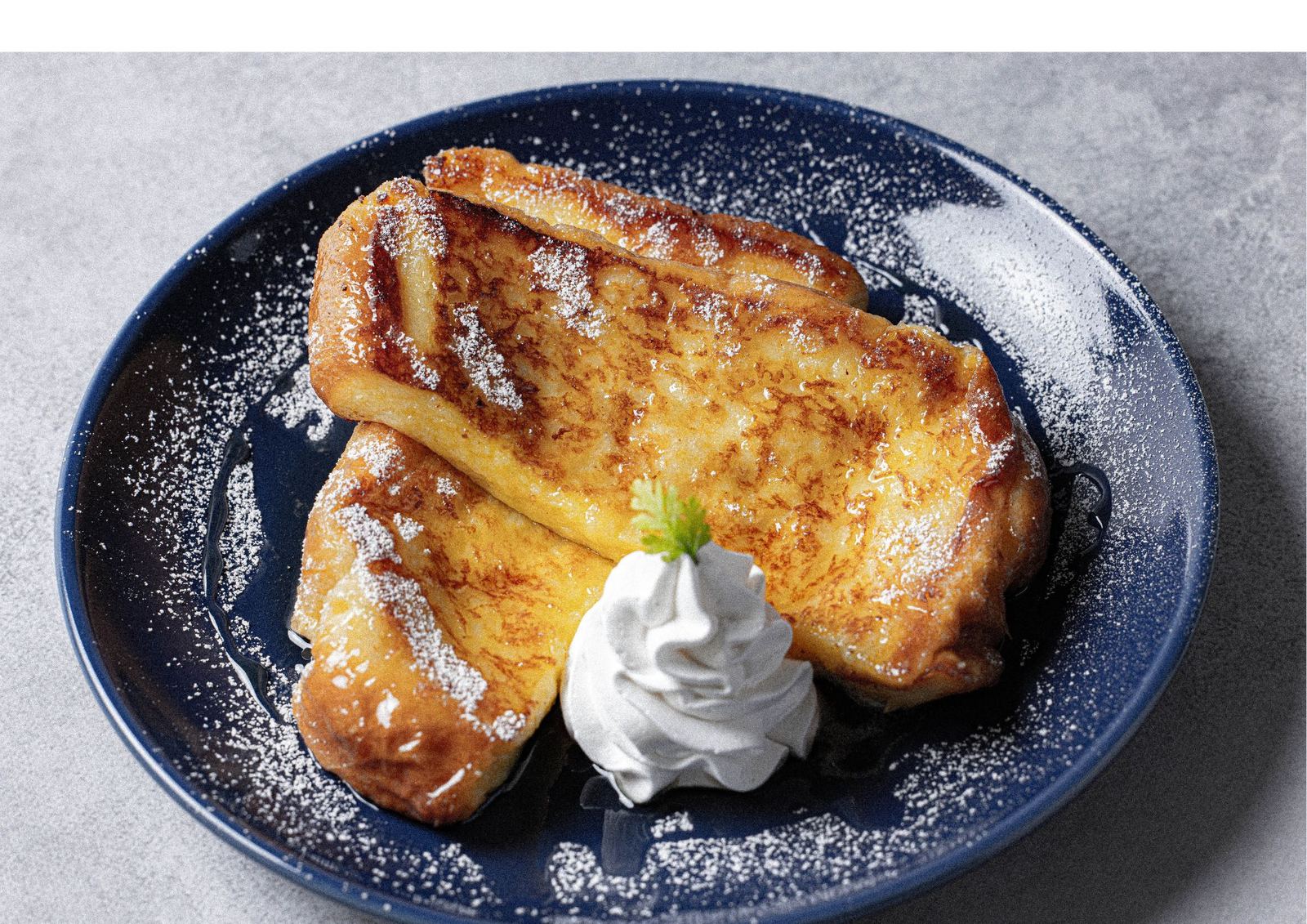
Rather than erasing the past, we chose to see it as a foundation — something to be honored, not hidden. Among the elements we carried forward was our original house-blend ice cream, a quiet favorite among regulars.
We reintroduced it not as a leftover, but as a meaningful part of the new experience, reimagined for a new context. Along with it, we redesigned the ice cream sleeve to reflect the refined tone of ATHENA COFFEE.
This act of preservation and renewal reminded us that a brand is not just made of new ideas, but also of the quiet, lasting pieces you choose to bring with you into the future.

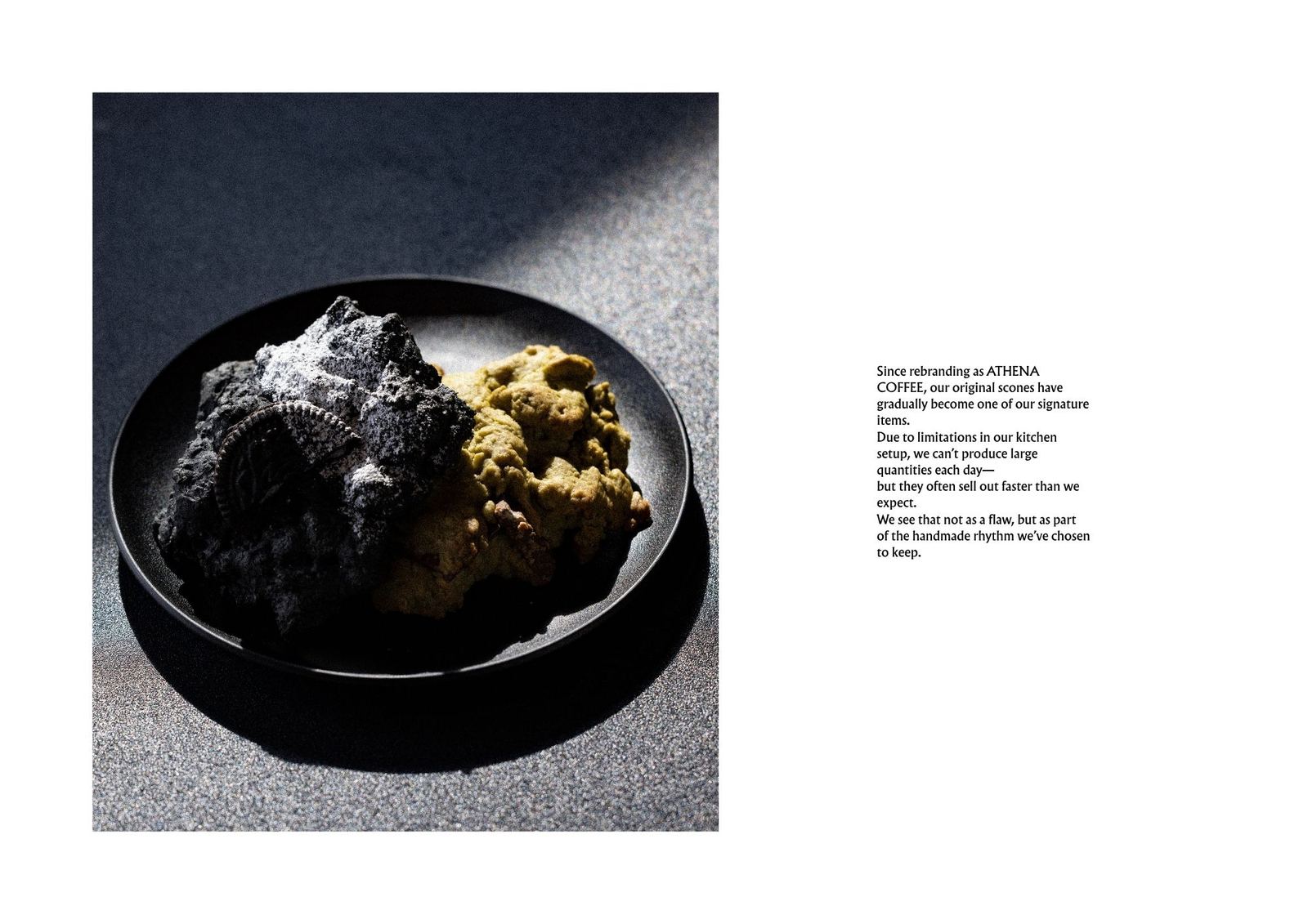
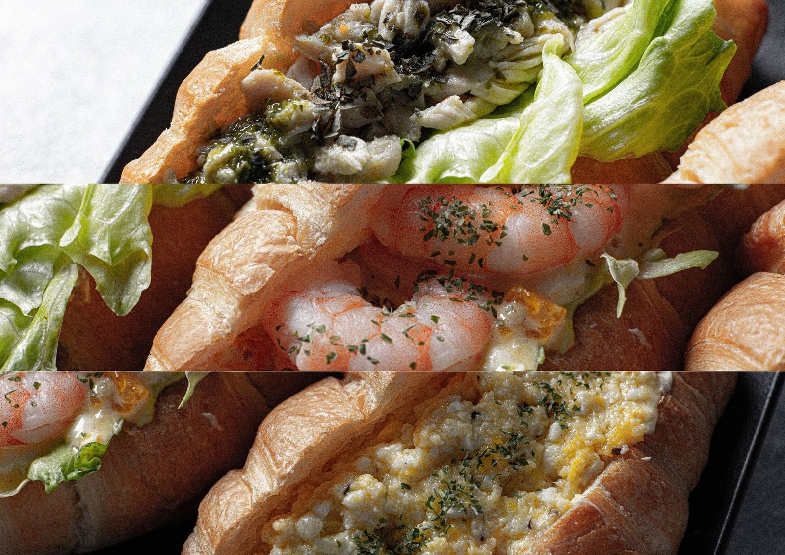
Since rebranding as ATHENA COFFEE, our original scones have gradually become one of our signature items. Due to limitations in our kitchen setup, we can't produce large quantities each day — but they often sell out faster than we expect.
We see that not as a flaw, but as part of the handmade rhythm we've chosen to keep.
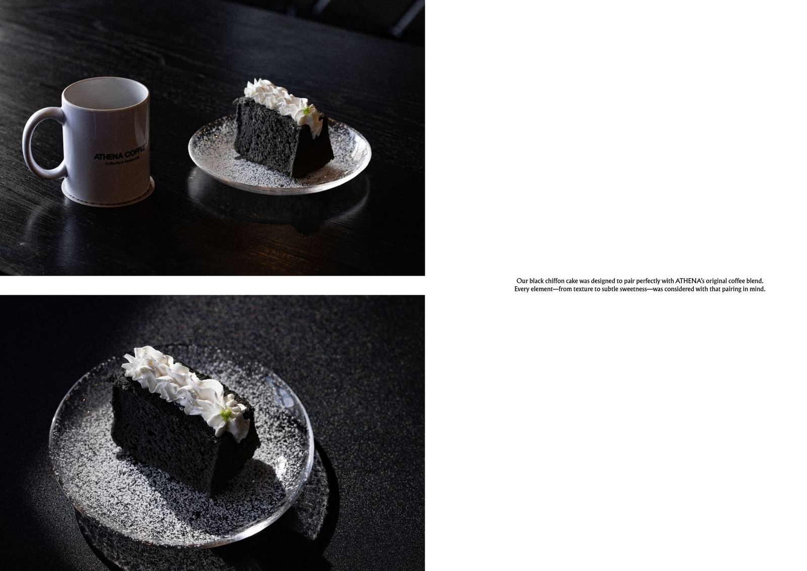
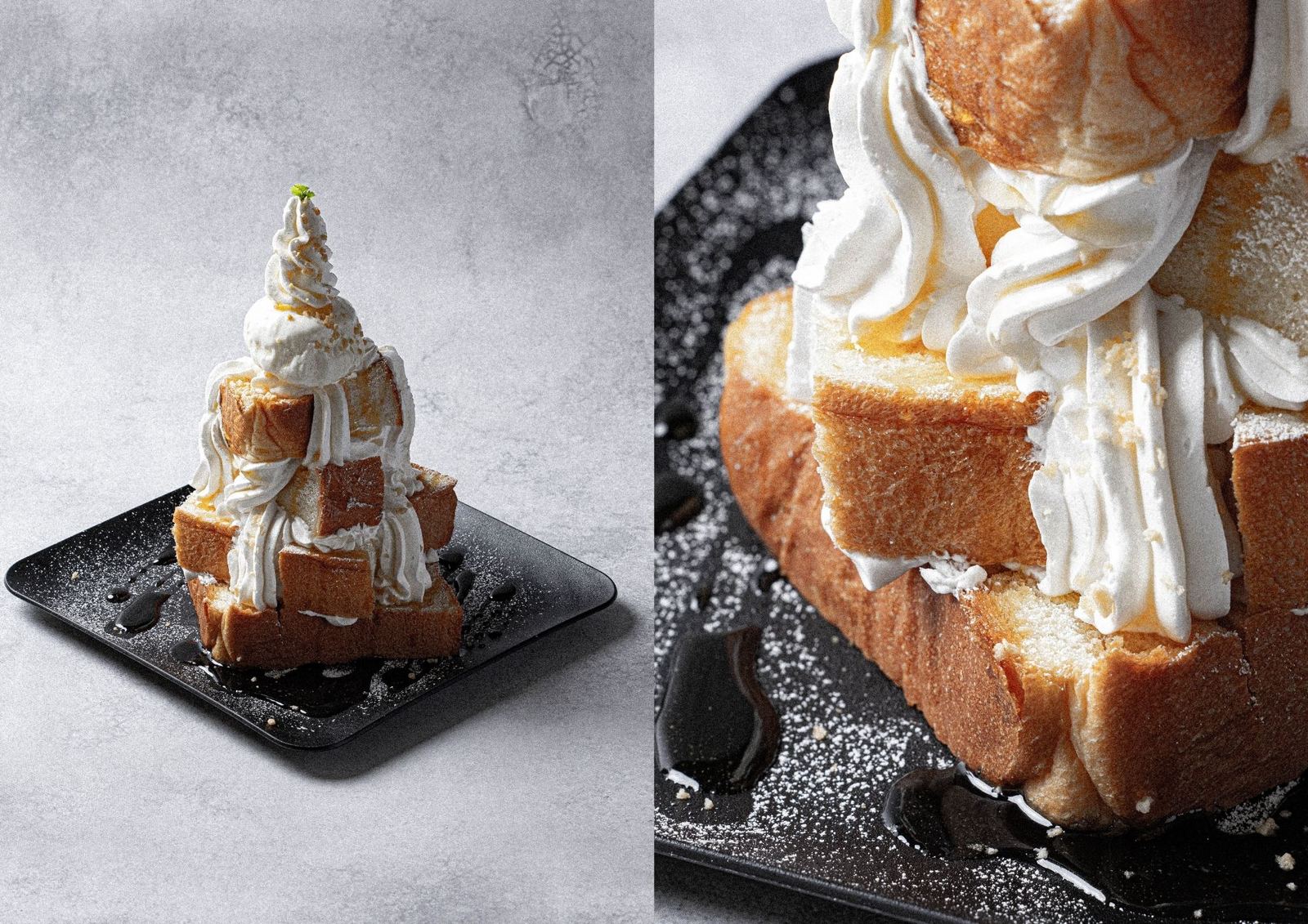
Our black chiffon cake was designed to pair perfectly with ATHENA's original coffee blend. Every element — from texture to subtle sweetness — was considered with that pairing in mind.