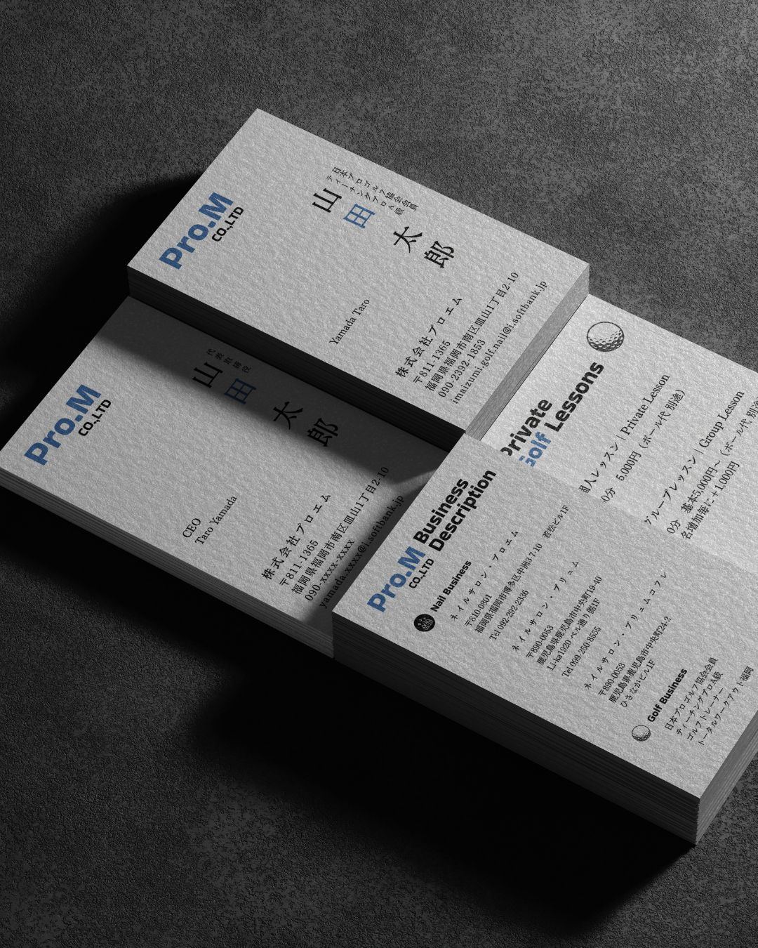
Business card system across two practices
One company, two practices — held together by a single typographic system.
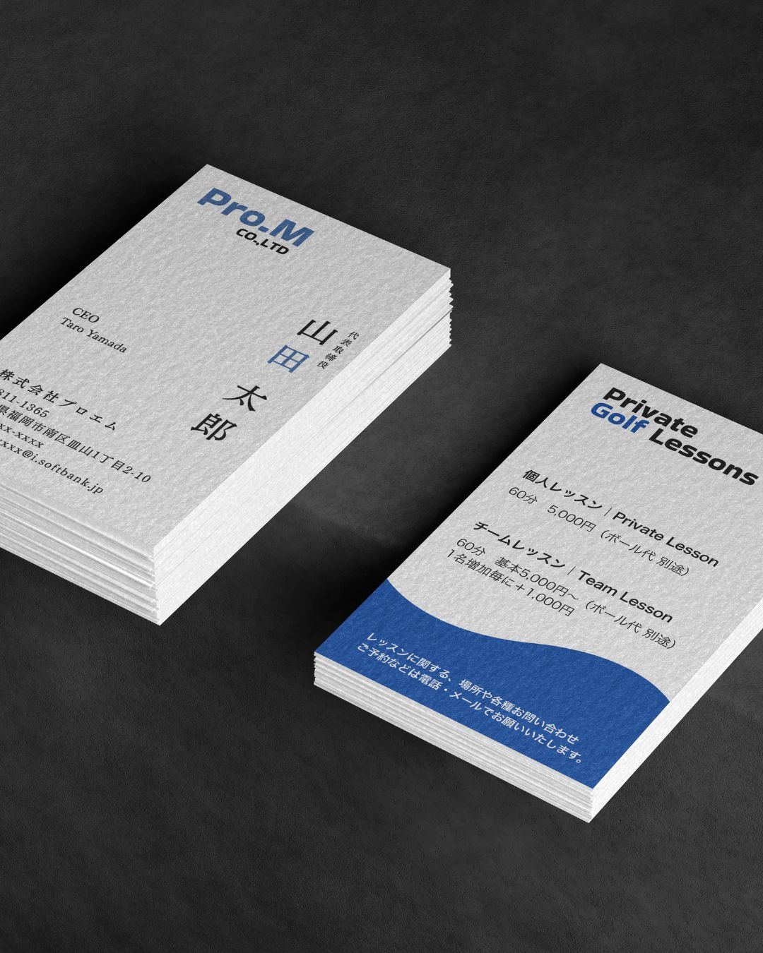
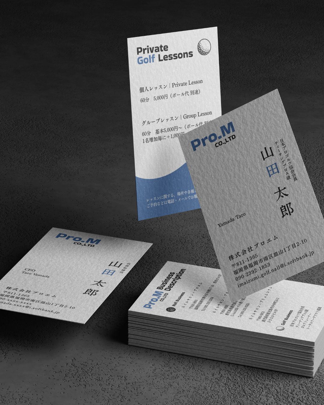
Pro.M operates two distinct businesses — Nail and Golf (Private Golf Lessons, JPGA Teaching Pro A-class). The identity treats both as belonging to a single parent: one wordmark, one paper stock, one typographic discipline, with the colour and the messaging shifting per practice.
The cards are vertical, set on a heavy uncoated stock, with a soft cobalt accent. Japanese name and English name treated as equal weight — neither subtitled, neither subordinate.
A reminder that a brand's coherence is not about sameness, but about a consistent set of decisions.